Flourish Wellbeing
Designing a new brand and image for Flourish Wellbeing - 2023 Co-Innovate Best Collaborative Design Awards
Role
Brand Designer
Industry
Health & Wellbeing
Duration
6 Months
The Brief
The goal was to rebrand Flourish Well, a mental health and recovery training organisation, by creating a new brand identity that better reflects the company’s compassionate and empowering mission. The goal was to increase client engagement, retention, and recognisability through visual transformation.
Project Planning
Research:
In-depth analysis of mental health challenges, colour psychology, and competitive brand aesthetics (Headspace, Mind, MHC).
Design Goals:
Reimagine the logo to express care, simplicity, and professionalism.
Develop a vibrant, psychologically relevant colour palette (blue, green, yellow, violet, orange).
Select accessible and friendly typography to evoke warmth and confidence.
Milestones:
Colour theory development
logo design
corporate brand assets
creation of a full brand style guide.
Deliverables:
New brand logo with scalable variations
Business card, promotional assets, and digital mockups
Comprehensive brand style guide
The Design Process
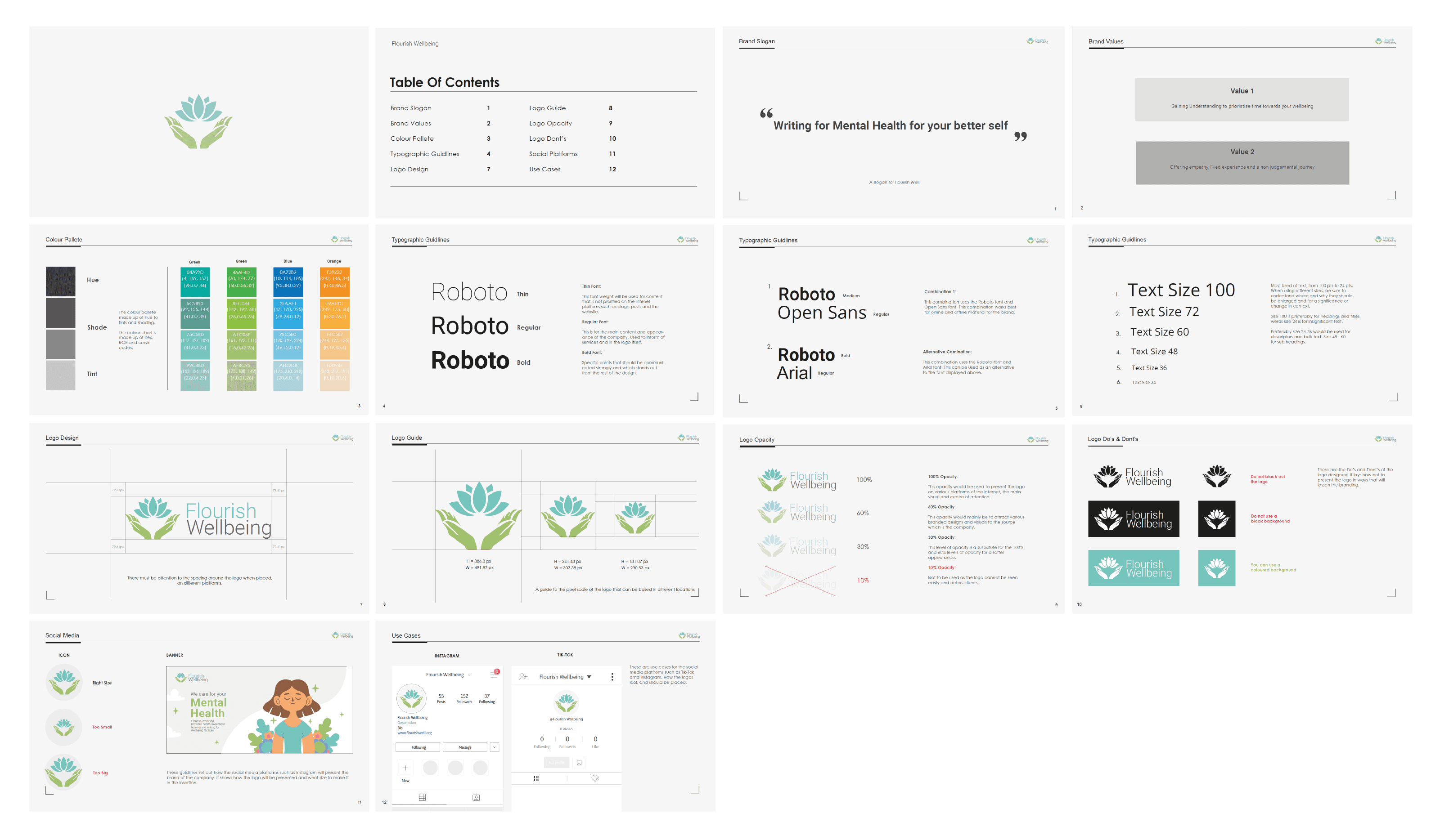
Milestone 1: Colour Theory
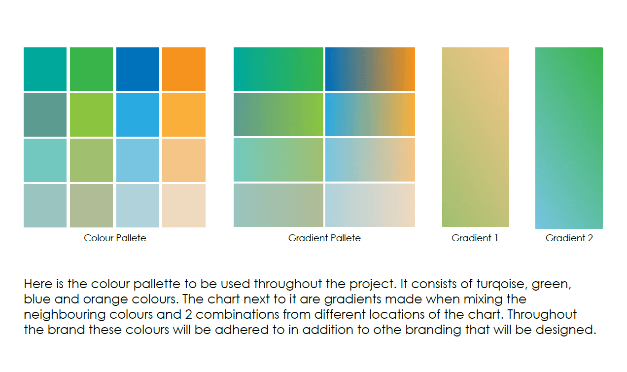
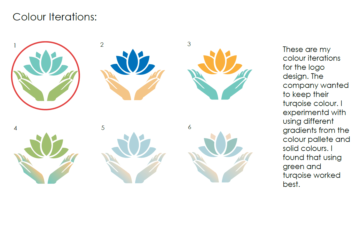
I explored colour psychology relevant to mental health, selecting a palette of turquoise, green, blue, and orange. These colours were chosen to evoke calm, optimism, and trust. Gradient variations were also developed. This formed the emotional foundation of the brand and influenced all later visual elements and applications.
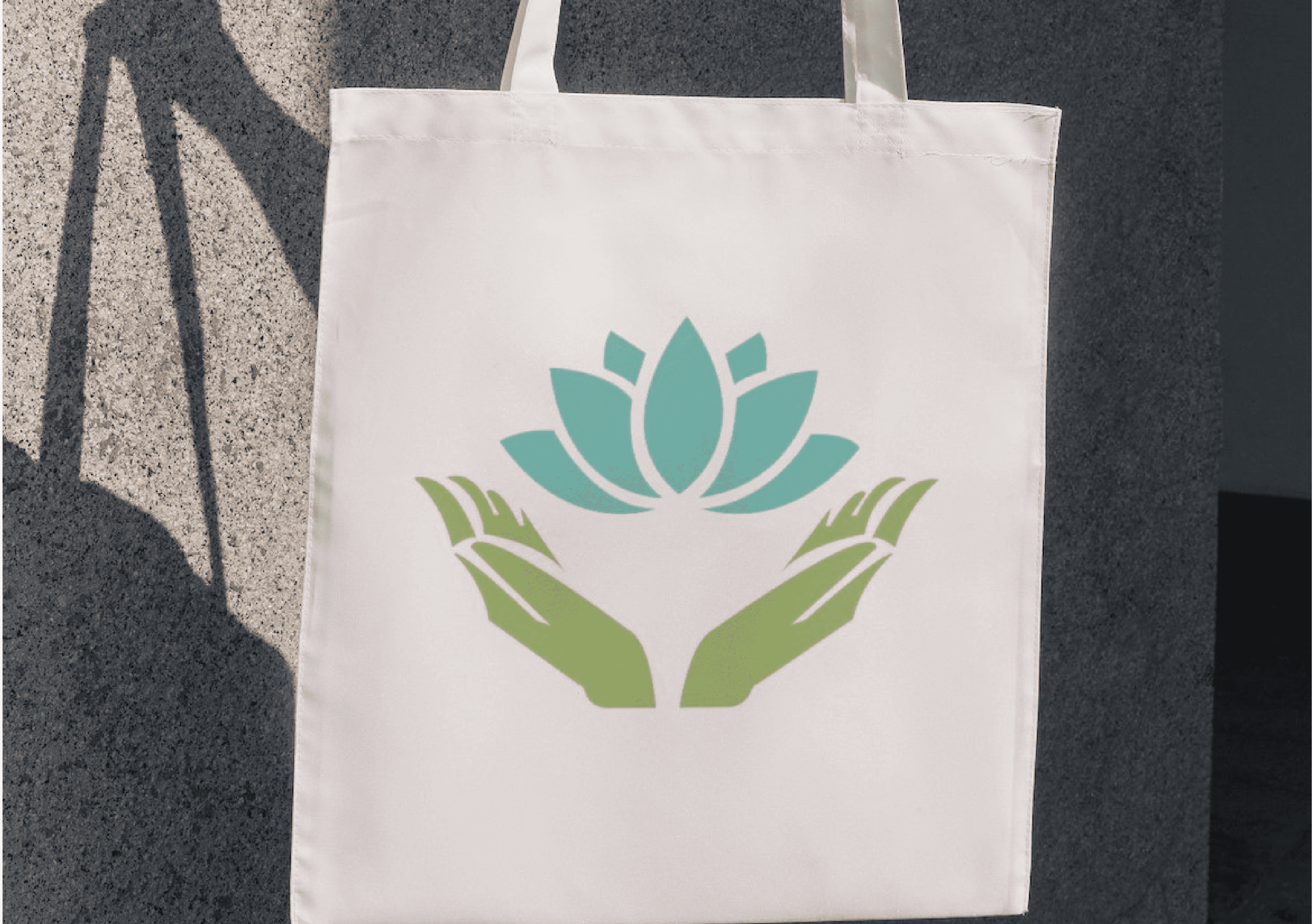
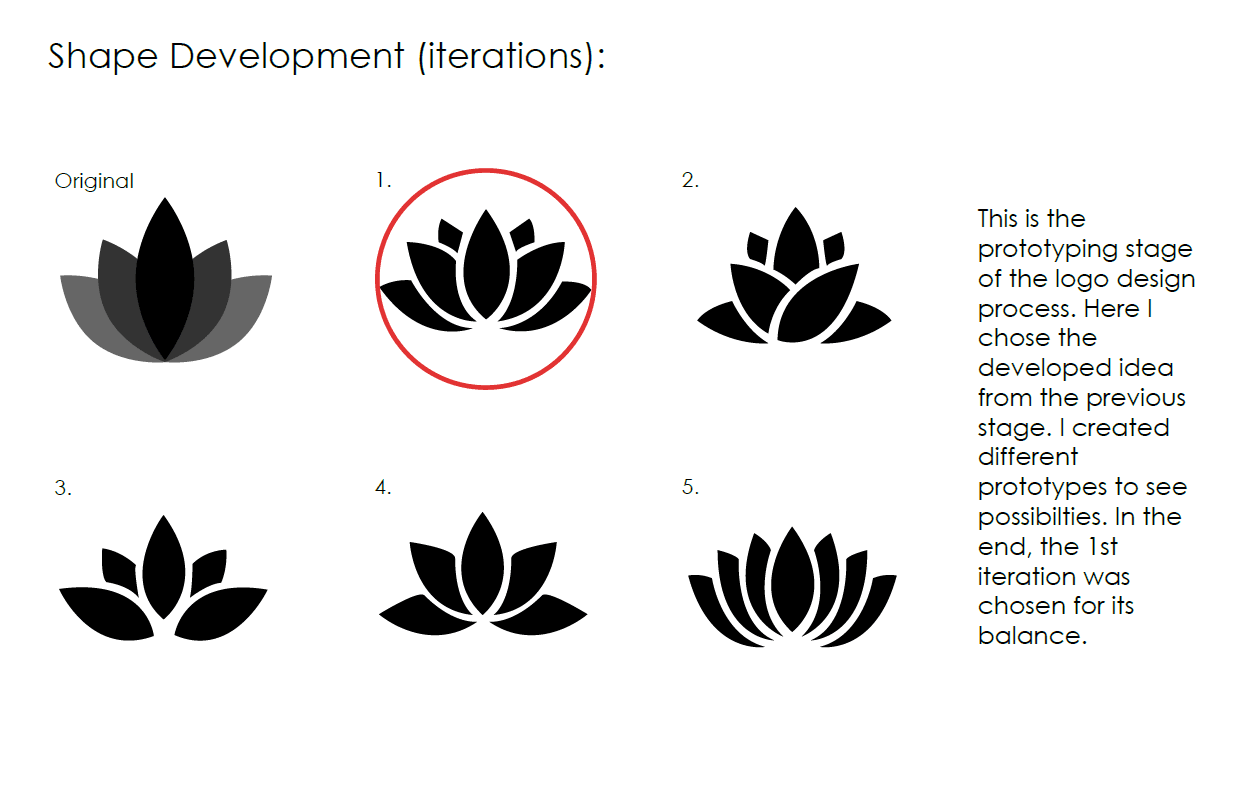
Milestone 2: Logo Design
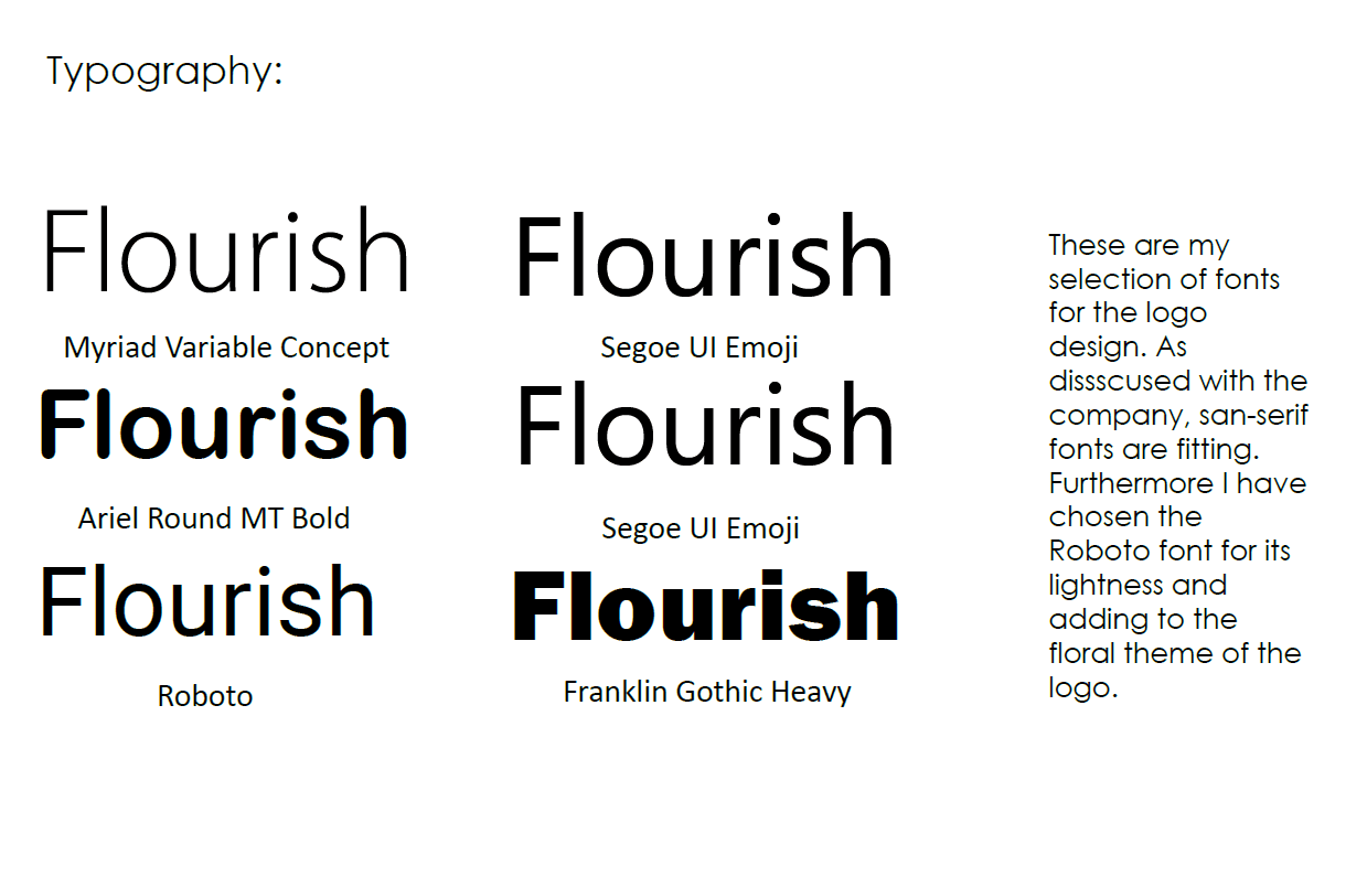
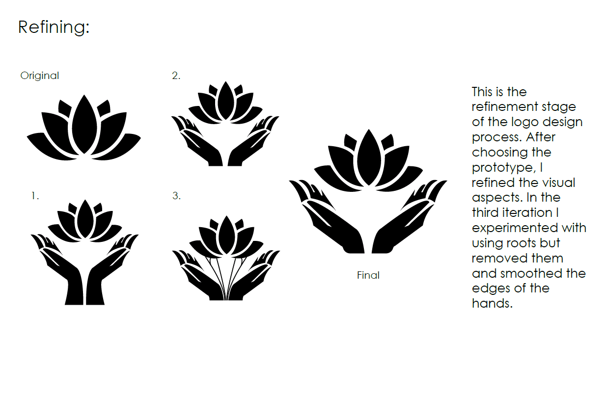
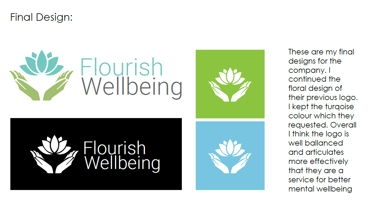
The logo design process began with digital sketches and multiple iterations focused on balance and simplicity. I retained the floral concept from the original branding and refined it with modern shapes and colours. Typography was carefully chosen, and final versions were tested for clarity, scale, and brand alignment.


Milestone 3: Corporate Branding
I applied the refreshed branding across corporate assets: business cards, letters, billboards, banners, and promotional items. Designs maintained consistency in colour and tone, aiming to elevate professionalism and increase brand recognition. Visual hierarchy, audience interaction, and first impressions were key considerations in this stage of application and presentation.
Milestone 4: Style Guide
The final milestone delivered a comprehensive brand guideline document. It detailed the brand’s slogan, core values, colour codes, fonts, logo usage, spacing rules, and social media templates. This ensures consistency across all platforms and touchpoints, giving the company a lasting, scalable identity ready for both digital and print environments.
The Outcome
At the end of the project, I felt proud of the final outcome and how closely it aligned with my initial vision. The client was genuinely pleased with the refreshed branding, noting its improved clarity, warmth, and professionalism. The positive feedback reinforced the effectiveness of my design decisions. The project was recognised for its creativity and impact, winning an award for Best Branding Strategy, which affirmed the value of thoughtful design in real-world, client-focused applications.
Other projects
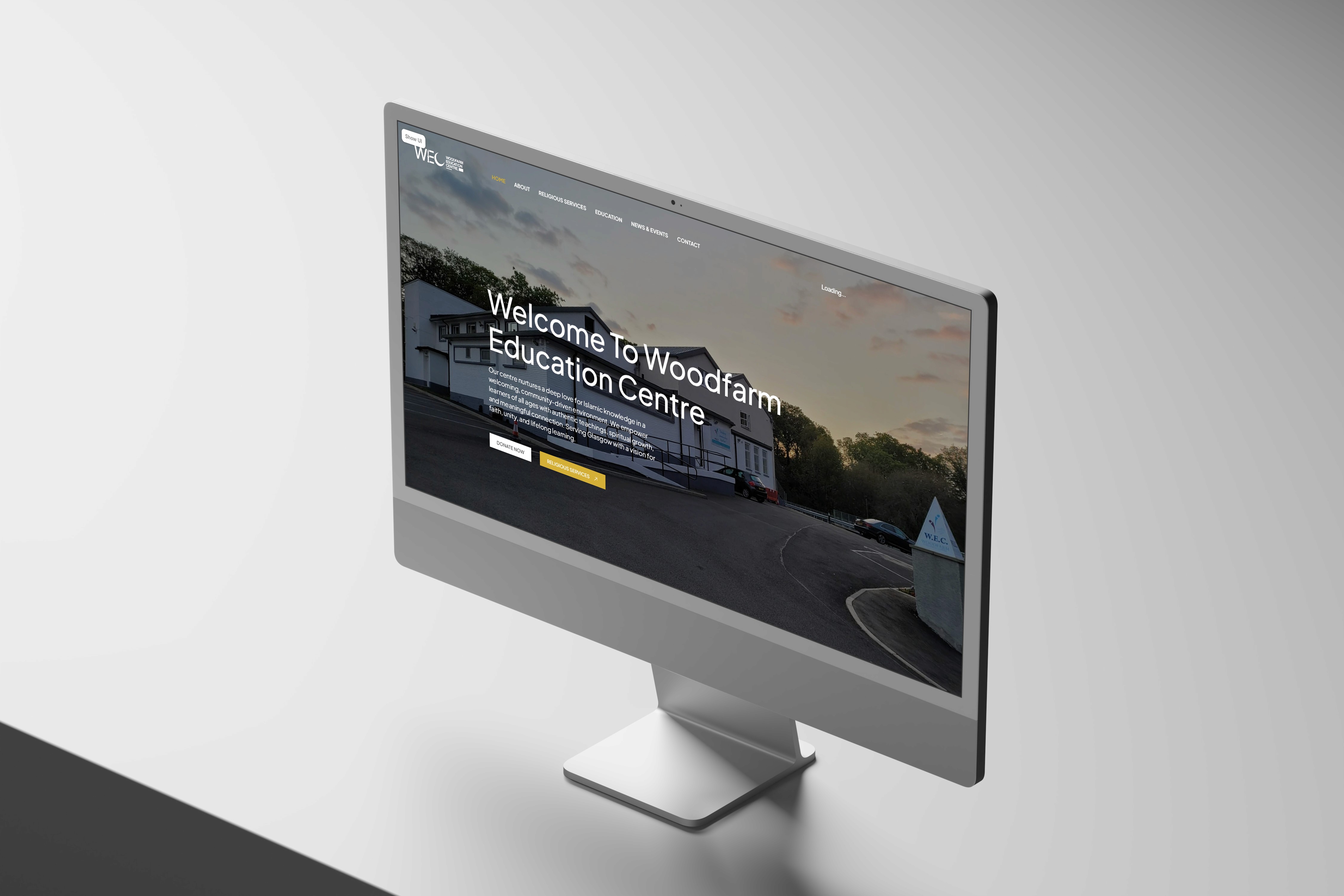
Woodfarm Education Centre
A website project as part of a community initiative. The project covered the UX and UI of a community website from discovery through to development.

JBrown International
Strengthening Brand Consistency Across Digital and Physical Touchpoints

Graduation Project: VYBE, The Autonomous Ride Hailing Service
A tailoured and revolutionairy ride hailing service for fully autonomous vehicles operating within London.

GreenFingers: A Garden Management System
Designing an IoT mobile application to manage garden crops and security.

Placement Work: Rebranding London Business Partnership
Designing a new brand logo and image for London Business Partnership

Eisenwald Decaying Kingdom Trailer
A Group Project for the 3D animation of a AAA games trailer.

A Digital Nature Walk Experience
Designing a digital experience app for nature enthusiasts end to encourage outdoor exploration.