Placement Work: Rebranding London Business Partnership
Designing a new brand logo and image for London Business Partnership
Role
Brand Designer
Industry
Consultation
Duration
9 Months

My Placement At London Business Partnership
During my placement year at university, I had the pleasure of taking up a marketing role with the London Business Partnership.
Established in 2012, London Business Partnership (LBP) focuses on enhancing the growth and sustainability of small and medium-sized enterprises (SMEs) throughout London, especially in West London. As a non-profit organization, LBP provides crucial support and resources to help these businesses succeed (London Business Partnership)
My role entailed 2 relevant responsibilities: the launch of their new website and the rebranding of their company, 2 great projects I had the chance to work in. This case study lays out the work I did for the rebranding.
Designing a New Brand
A part of the project, I had to work with the manager and owner of the company to brainstorm different ideas for the new company image.
What the previous branding looked like:

Their previous branding had not changed since 2012, it was old and outdated, the directors of the company wanted change and saw the potential of my work and asked for my advice.
The Design Process
I first started with researching London Business Partnership's competitors and current design trends. This gave me an idea on what to expect and to create a brand that could compete with them.
Step 1 was to create a moodboard:

The moodboard helped to put my thoughts onto paper and to show the directors my design, thinking. To create a minimal design that combined shapes and the name of the company.
Step 2 - was to come up with the colour pallette and fonts:


This step was crucial to the branding. I had brainstormed different shades, and after discussions with the directors, we decided to use corporate green/turquoise colours. The directors wanted colours that inspired professionalism and calm, as most clients they receive are either financially strained or require assistance and aid, they wanted to provide a warm and nonjudgmental atmosphere. The image on the right shows the fonts that were used.
Step 3 - logo development:


This step lays out the logo development and design rigour I had went through with the directors of the company, the red circles show all the design itterations they chose going forward.
The Rebranding Project
The full rebranding process - implementing the new brand across all touch points, physical and digital. These pages bring the outcome to life.


Outcome
The final branding came out better then expected, the directors of London Business Partnership loved the redesign. The logo and colours were such a hit that I was also tasked with creating various offline and online materials to take with them to various business shows. In the end, the rebranding project transformed their brand and outreach, and as the Digital Design/Marketing Officer, I saw the steady incline in client and digital outreach numbers.
Other projects
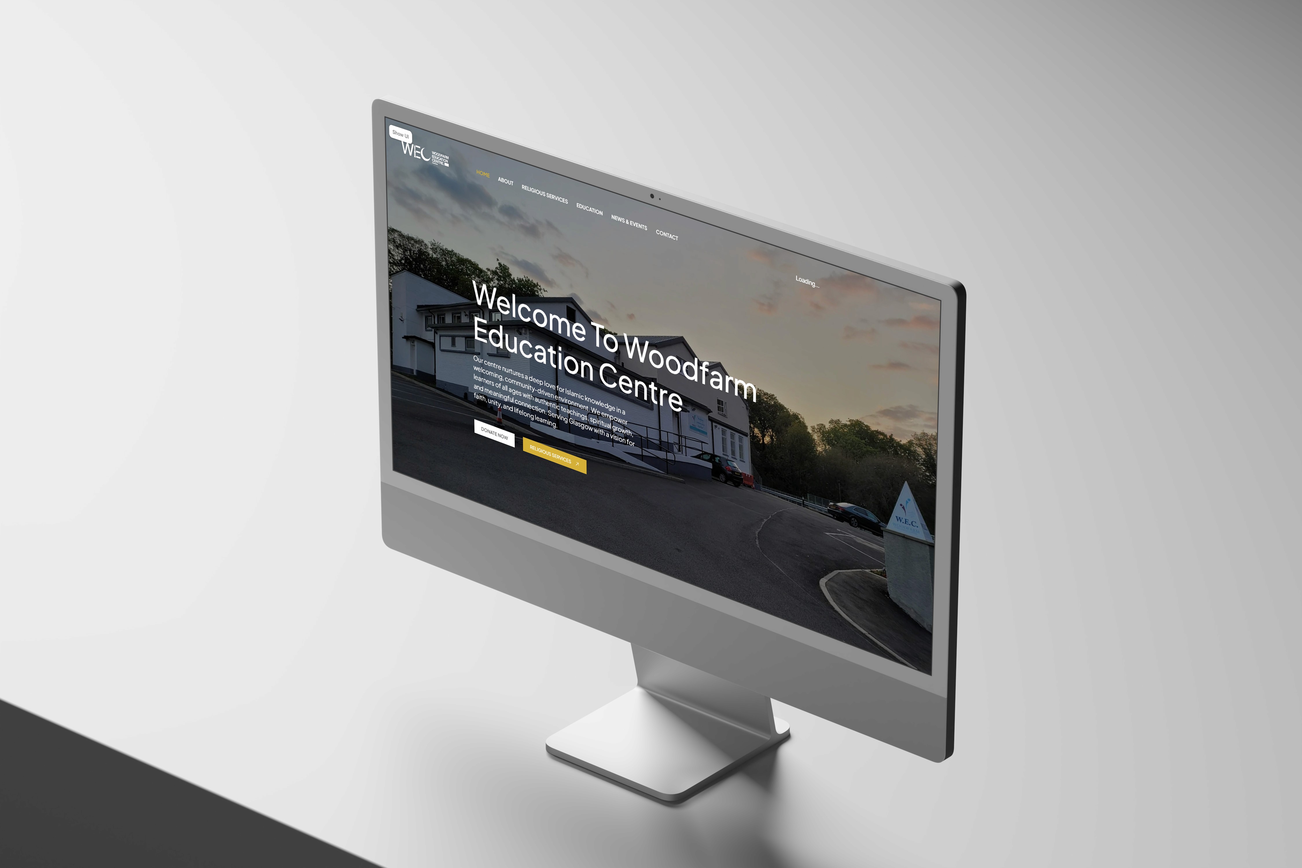
Woodfarm Education Centre
A website project as part of a community initiative. The project covered the UX and UI of a community website from discovery through to development.

JBrown International
Strengthening Brand Consistency Across Digital and Physical Touchpoints

Graduation Project: VYBE, The Autonomous Ride Hailing Service
A tailoured and revolutionairy ride hailing service for fully autonomous vehicles operating within London.

GreenFingers: A Garden Management System
Designing an IoT mobile application to manage garden crops and security.
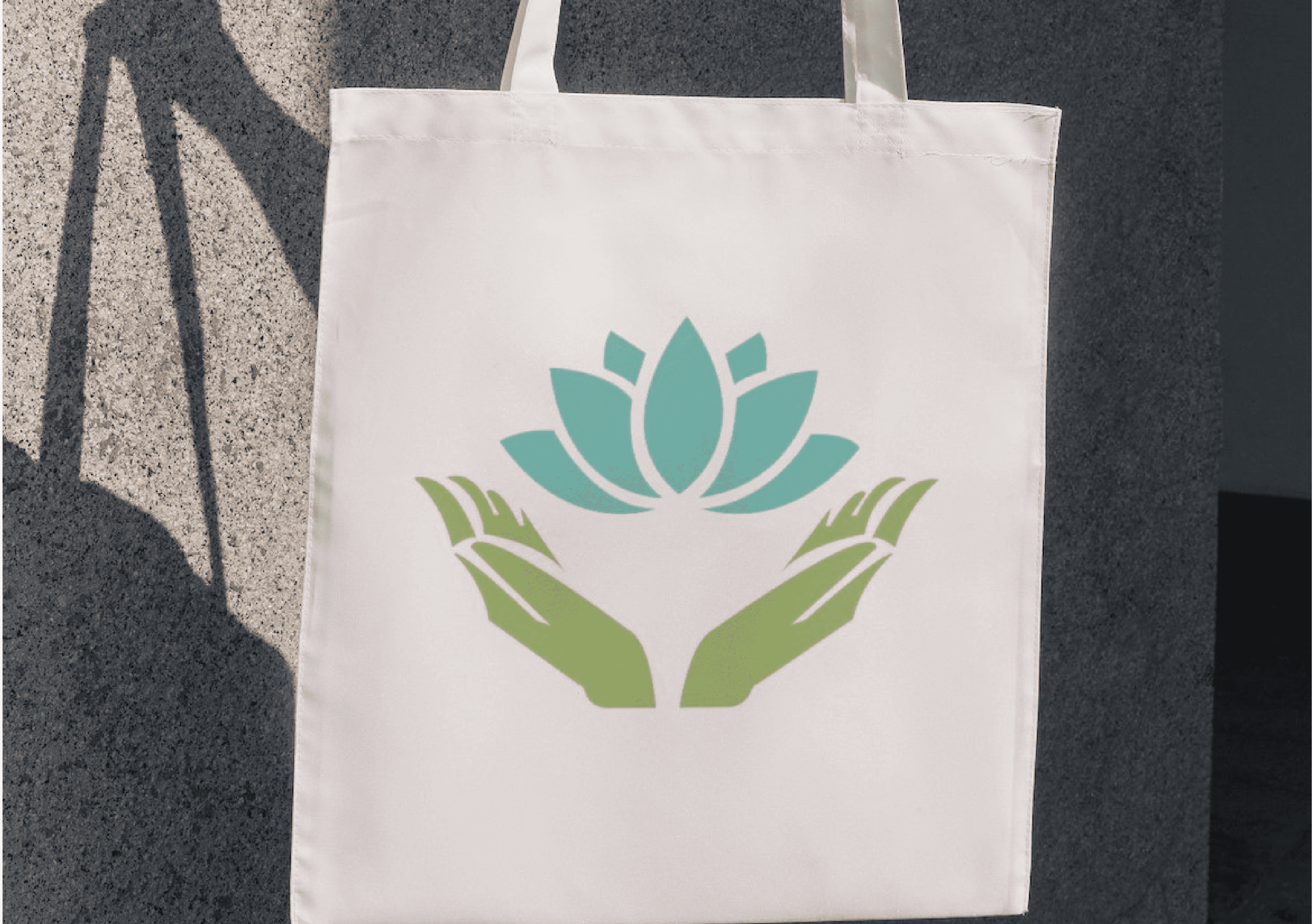
Flourish Wellbeing
Designing a new brand and image for Flourish Wellbeing - 2023 Co-Innovate Best Collaborative Design Awards

Eisenwald Decaying Kingdom Trailer
A Group Project for the 3D animation of a AAA games trailer.

A Digital Nature Walk Experience
Designing a digital experience app for nature enthusiasts end to encourage outdoor exploration.