JBrown International
Strengthening Brand Consistency Across Digital and Physical Touchpoints
Role
Brand Designer
Industry
Real Estate
Duration
2 Weeks

At JBrown International, I led a brand refinement project focused on updating typography and creating stronger consistency across all customer-facing media. I began by reviewing the existing brand guidelines, auditing the website, landlord brochures, door vinyls, and graphic assets to identify inconsistencies in font hierarchy, readability, and visual tone.


After analysing competitor branding within the London commercial real estate sector, I explored several typeface pairings that balanced professionalism with a more contemporary feel. I tested font weights, spacing, and hierarchy systems across both print and digital layouts to ensure accessibility and consistency.


Once the typography direction was approved, I updated the brand guidelines to document rules for headings, body copy, spacing, and asset usage. I then applied the refreshed system across the website, marketing brochures, commercial property vinyls, and supporting graphics, ensuring every touchpoint felt cohesive, modern, and recognisable to clients.
Other projects
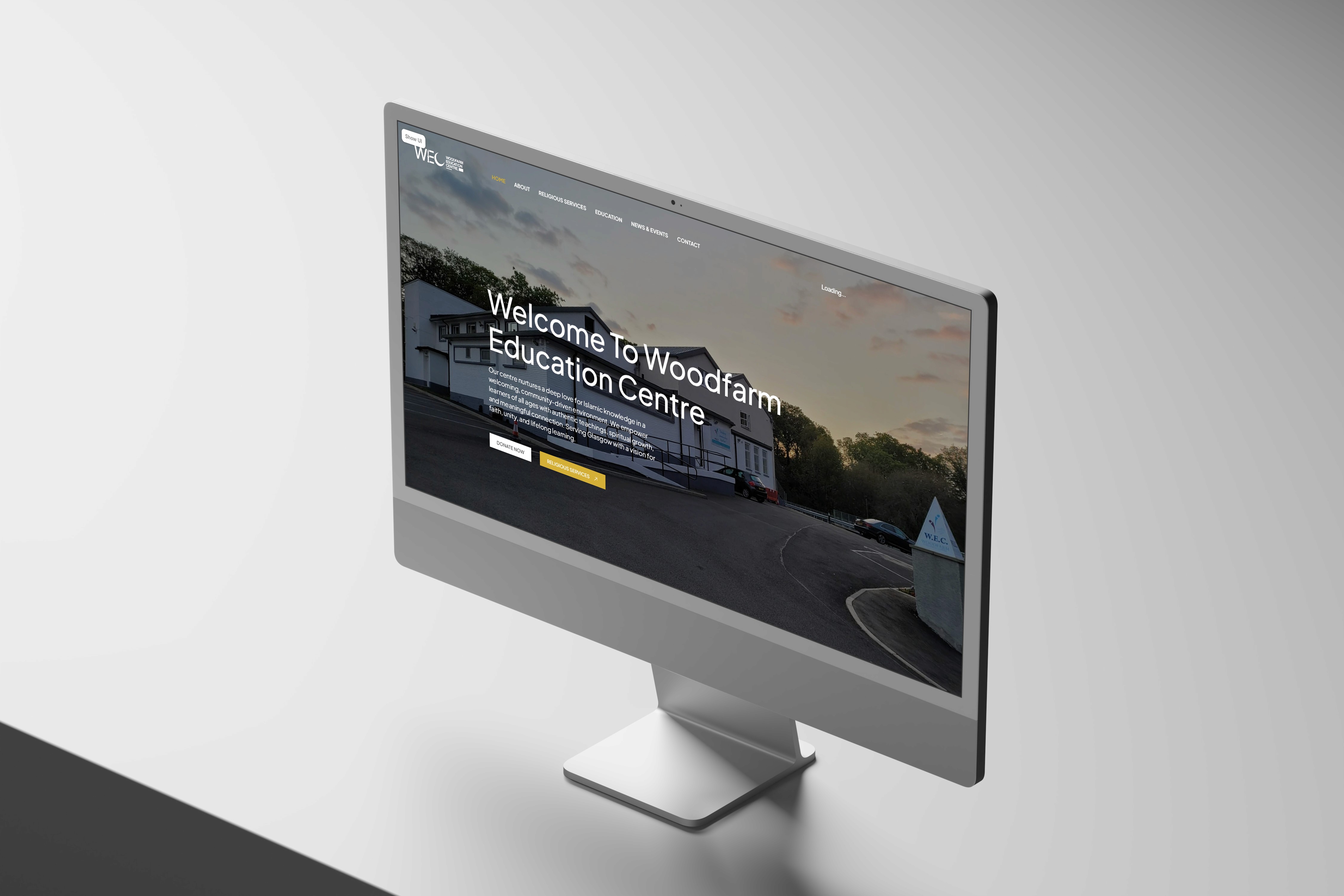
Woodfarm Education Centre
A website project as part of a community initiative. The project covered the UX and UI of a community website from discovery through to development.

Graduation Project: VYBE, The Autonomous Ride Hailing Service
A tailoured and revolutionairy ride hailing service for fully autonomous vehicles operating within London.

GreenFingers: A Garden Management System
Designing an IoT mobile application to manage garden crops and security.

Placement Work: Rebranding London Business Partnership
Designing a new brand logo and image for London Business Partnership
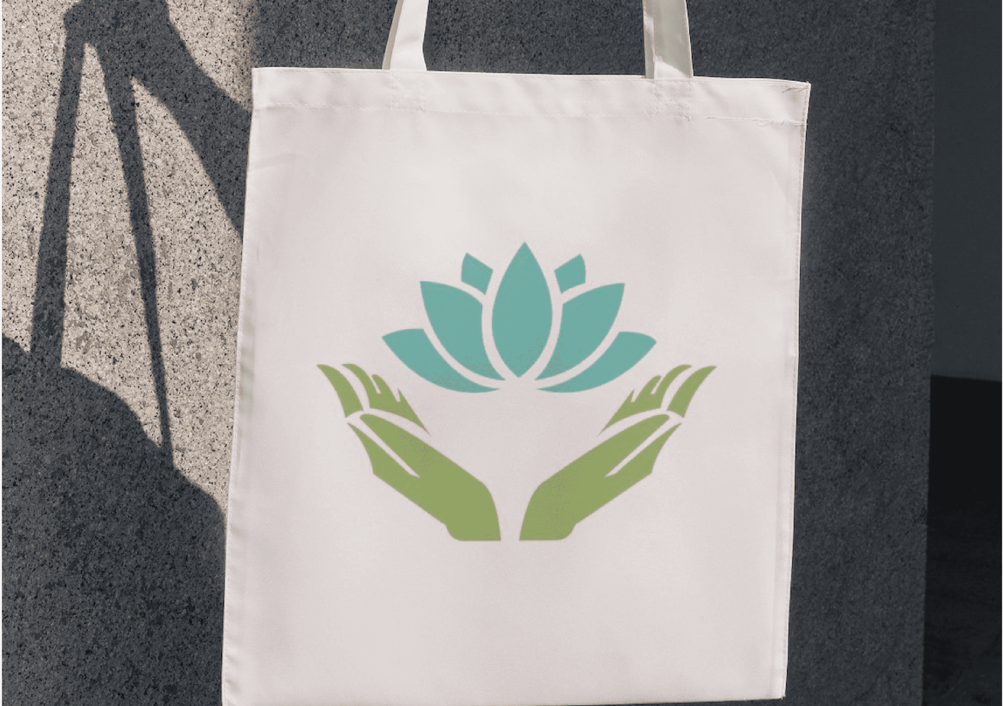
Flourish Wellbeing
Designing a new brand and image for Flourish Wellbeing - 2023 Co-Innovate Best Collaborative Design Awards

Eisenwald Decaying Kingdom Trailer
A Group Project for the 3D animation of a AAA games trailer.

A Digital Nature Walk Experience
Designing a digital experience app for nature enthusiasts end to encourage outdoor exploration.